Sunday, March 25, 2007

United Nations Environmental Programme Murals

[Blockprint 'Sun" by John Paul Thornton]


I have been invited to design a series of murals for the United Nations Environmental Programme.
The completed series will be displayed at the Nobel Peace Center in Oslo Norway, beginning on World Environment Day, June 5th, 2007

A contributing team of young artists from the Full Circle Learning Program in Los Angeles California will be collaborating on the project with me, which will include the creation of over one hundred block prints describing aspects of climate change caused by our Earth's shrinking polar ice caps.

An exciting aspect of the mural's visual imagery will be created using a contemporary version of traditional block printing. Using this technique, symbols and drawings are carved into the surface of a block, which is then coated with ink. The image on the ink-covered surface is then transfered directly (in reverse) onto the surface of the mural.


The initial meeting between myself and the team took place last week at the home of coordinator, Teresa Langness. Each of the selected young teen-aged participating artists was chosen for their dynamic capacity to play active rolls in social change. They are outspoken, confident, talented and inspiring. I introduced the concept for the mural pieces, which will consist of twelve panels, each conveying graphic visual components of how temperature changes can affect wildlife, forests, oceans and human habitats.

The final gorgeous results will be seen by thousands of viewers from around the world including those expected to attend the United Nations Environmental Summit.

Thursday, March 22, 2007

Two Encounters With Nude Women

How do we "see"?

Here are two figure studies I created from direct experiences with live models. For each painting, I used only four tubes of paint: Alizarin Crimson, Yellow Ochre, Black and White.
Any other sense of color created is an optical illusion. For example: I used no "blue" or "green"
paint, but these colors appear to the viewer's eye.


[Marissa by John Paul Thornton]


I literally began the painting with the single slash of light falling on the cheek below the shadowed eye socket. It was the lightest light that I saw. From there, I worked around the face, carefully observing and mixing the exact color and value of each plane change.


The light fell upon three distinct areas: The upper cheekbone, the collar bone and the breast. The breast itself was conceived as a simplified form of warm and cool color. Notice the dark accents which create the illusion of depth, and the sense of gravity.

For me, the most exciting painterly challenge for artists is the fusion of the three great languages of optical phenomena: Realism, Impressionism and Abstraction.

Optical Realism refers to the way light and dark describe forms, causing them to actually appear to our eyes, (particularly when we are focusing on a specific small area).

Impressionism refers to the way things appear to our eyes when we are not focused on them. Forms blur, begin to fall apart or shimmer.

Abstraction refers to the way forms lose their definite structure and recognizable clarity, (especially when they are in our peripheral vision).

Try this: look closely at your hand. Now focus on your index finger. As you are focusing on the clarity and texture of your digit, notice how your other fingers are not quite as sharp. Take it a step further: While still focusing on your index finger, notice how other elements radiating out from your focus are becoming blurred, unrecognizable shapes.

Of course, if you refocus to another finger or the various peripheral parts of the room you are in, then this new focus will become the clear realistic aspect, with other aspects suddenly becoming impressionistic and abstract...

Here's an example:


[Patricia By John Paul Thornton]

With my painting of Patricia, I began with the brightest sheen of highlight on her skin. This area of realism is most in focus and solid. From there I spiralled out, with each spiral becoming more impressionistic. This is the way our eye sees, focusing on one small area, with the areas in our peripheral vision becoming less sharp and defined. Her receding back and ribcage dissolve finally into abstraction according to the way my eyes experienced her.


Here is my area of greatest realism, and my area of focus.


Though her feet were closer to me than was her hip, her feet were not my intended area of focus. I painted them more impressionistic, in a kind of calligraphic shorthand. Individual accents of darkness give weight and clarity to form, while other edges soften and fuse to the surrounding background.


Finally, as my focus was not on her shoulders or head, I painted them as they appeared to my eye, as abstract shapes. This approach all depends upon what I choose as my area of focus. I could have chosen her ear, her toe, or an object in the room near her, and the whole painting would shift into a new combination.

This is how the three great languages of painting may exist on the same canvas simultaneously.

The other elements of creating came from my heart, from a place of emotion. A perception of their skin, their subtle movement, their breath, their physical presence... all of these components are quite personal. They are the ingredients of the most religious and sensual painting moments. However, to quote Picasso, "Art is never Chaste."

Monday, February 26, 2007

Rene Magritte: An Uncomfortable Truth


It is delightful to see a major museum dance with glee while they really ought to be squirming with near-apology about an uncomfortable truth.

The Los Angeles County Museum of Art is about to close it’s presentation of the world class exhibition called "Magritte And Contemporary Art- The Treachery of Images.” Hanging as the centerpiece of the exhibition is LACMA's Magritte masterpiece— The Treachery of Images (This Is Not a Pipe), (1929)— described as a seminal painting and popular cultural icon. The show has been the talk of the Los Angeles art scene for the last three months as artists and art-lovers of all ages have been flocking to see the much-applauded spectacle of an art show that is actually fun.

I must admit that for decades I have carried within me a prejudice towards the lovable Belgian painter, who was linked to the Surrealist movement. I always assumed however that an exhibition dedicated to Rene Magritte would be akin to opening up a canister of whipped cream and happily swallowing the frothy desert-topping straight from the nozzle. I thought that it would be like getting a pie in the face by a clown. At least that’s what I was led to believe, thanks to biased art history professors who have presented Magritte and his surreal artworks as mere quirky jokes, or playful one-liners. After viewing this grand show I discovered the real truth: to be confronted by this master’s vast body of art is to be nearly floored by his dedication to a vision that is unique in the world.

Yet, thanks to LACMA, we are not allowed the purity of that true experience.

Magritte is not permitted to stand alone. To great dismay, Magritte’s unerring technical prowess and his iconic manifestations of dream-like imagery are not allowed to speak for themselves. Instead, curator Stephanie Barron has insisted on intermingling derivative artworks by thirty-one other contemporary artists placed along side the Belgian master. Interesting... and uncomfortable.

It goes like this: First we may admire a Magritte original, then we must look at an obviously unoriginal painting by another “famous” artist.

Instead of enjoying Magritte’s vision, we must stomach constant interruptions by other artists who were "inspired" by Magritte. Why? The idea, we must suppose, is to impress us with the notion that these additional artists are spiritually connected to Magritte by their "borrowing" his concepts about text and imagery. The unintended result is that it exposes our "greatest" post-modern artists as not really being all that original or creative. Yikes!

So here's the question: Who had more courage? The surreal originator Rene Magritte, or the often shameless "borrowers" of his images?

Aside from exposing these thirty-one artists, the resulting comparison between Rene Magritte and the "others" produces a weird suspicion that there is either a political agenda or a down-right fear of purity afoot. It feels like LACMA is grafting these "others" onto Magritte's legacy in a forced way. Remember the film Forrest Gump, where through artificial computer enhancement, Gump appears at great moments in history?
"Look! There's Forrest with Kennedy!"
"Look! There's Forrest with John Lennon!"
"Look! There's Jeff Koons doing Magritte!"

This juxtaposing is interesting but annoying. Imagine trying to savor the main course at an outstanding restaurant while bus-boys flick greasy french fries at your mouth. Imagine watching a classic movie chopped up with dumb commercial breaks trying to sell you cheap tie-in products. That is how a visit to Magritte and Contemporary Art: A Treachery Of Images felt to me.

I had the chance to attend the gala opening of this show, as well as to visit again on two separate mornings. On all occasions, crowds packed the spacious galleries and families frolicked among the artworks in a Disney-like atmosphere. The Los Angeles County museum went all-out to suggest the topsy-turvy world of surrealism by encouraging artist John Baldessari to design a zany environment by which to unify the show, while reflecting Magritte's imagery. Baldessari does so by installing a vast carpet on the floor that resembles a cloud-filled sky. Look up at the ceiling, and visitors will see wallpaper murals of a cityscape strangled by endless freeway intersections. In other words, down is up and up is down.

Chattering groups of school children love this cartoon dreamworld while even jaded art-aficionados smirk at its cuteness. It is a pleasure to experience a presentation that playfully draws viewers in to a make-believe art-land. Yet at the same time, it seemed that the curators and LACMA were uncomfortable about simply showing Magritte’s art. Our attention-deficit disorder world has officially gripped block-buster museum shows as well. Did the designers feel they had to distract us ? Did they feel that we had to experience his work in the context of a visual joke? This was not necessary. Having to throw in unoriginal knock-offs by additional “serious” contemporary artists as a way to justify the appreciation of Magritte’s work just wasn’t necessary either.

By the way, Magritte kicks ass. Actually, what was most enjoyable about my visits was watching crowds of art-lovers face this uncomfortable truth. Fellow museum-goers first confront the star of the show, Rene Magritte, and then turn to view the decidedly rip-off work by comparably stuffy Andy Warhol, Jasper Johns and company. I watched as art fans “In the know” approached the interspersed contemporary artists with gleaming smiles of anticipation. Yet, after summing up the inferior work they always seemed to shuffle away looking disappointed. (Or enlightened). Any illusion that their favorite contemporary post-modern hero could hold up against Rene Magritte was shattered. Meanwhile, visitors who obviously didn't give a hoot about art pedigree joyfully passed by the intermingled contemporary artworks as if they were invisible to the eye. There has rarely been a more magical example of The Emperor's New Clothes in action.

Academic museum goers bent upon distancing themselves from the sheer appreciation of painting as an art form in order to wallow in conceptualization could not escape the fact that Magritte knew his shit.

“Jesus, he could really paint” whispered countless viewers, many of them hissing their words.
Exemplary technique was still considered the mark of a loser during the last two decades of Magritte’s life. Still, he bravely painted and designed with a care and mastery that could possibly rival Albrect Durer, the great German Renaissance painter. Just to prove that Magritte was not a noodling, conservative commercial artist, the LACMA Museum show also features a series of his paintings that were executed in a purposefully god-awful manner. (Magritte decided for a time to try painting bad on purpose). Called the vache series, (vache meaning cow, or ugly). They could be some of the stupidest artworks ever made, but they were his original stupid artworks, created before the age of irony. They were “lame” long before lame paintings became the calculated fashion.

Since they didn’t sell well in galleries, he cheerfully abandoned “bad Painting” and went back to painting in his true voice. After all, it seems he could paint any way he wanted to.

You can read about the psychological ramifications of Magritte's imagery elsewhere. There is an intensity to Magritte’s paintings that is stunning. They are far more than whimsical. The deliberate exploration of concept and careful construction of his layouts suggests a passion and sureness that all painters secretly yearn for…

Image after image rings with familiarity and we realize how much his “look” has been used by current advertising, design and music video production. If the connection with a society has anything to do with the success of an artist, (and it does), then Magritte has achieved a success of great proportions, out stepping almost anyone who ever picked up a brush.

Of course, the genius of Magritte was actually prophesied by the most unlikely of painters decades earlier in the year 1902. Arch neo-classical academic realist painter Jean-Leon Gerome was famous for his serious depictions of polished Greek and Roman figures, but was also the cool punster behind this little known painting titled "O pti Cien".


A play on the words "Optician" ( eye specialist) and "Oh, Petit Cien" (Little Dog) , It stands historically as one of the first artworks to rely upon text and visual word play. It also includes the use of funky found objects. Nineteenth century master Jean Leon Gerome and twentieth century Surrealist Rene Magritte could have almost been drinking buddies...


Saturday, January 27, 2007

Wabi-Sabi: Imperfect Beauty


[Tokyo Rain by John Paul Thornton]


"What is Wabi-Sabi?" I asked.

It was a rain-drenched evening in Tokyo. A typhoon had hit earlier that day, spawning seas of bustling umbrellas beneath the towering neon skyscrapers of the Blade-Runner like Shinjuku district. In the midst of the flury I had been driven by a pair of Japanese artists to the Tokyo Museum of Art. We could be dry, and become lost in the comforting quiet that museums extend to the weary.

“What does Wabi-Sabi mean?”
The question was innocent enough, but my Japanese hosts just responded with big smiles that grew into nervous laughs. I stood there in the middle of the Museum, waiting for them to answer me. Instead, they turned away as if the matter were closed and walked ahead to silently ponder a ceramic bowl.

Say “Wah-bee Saw-bee”

I had never heard of the word Wabi-Sabi until my hosts had begun whispering it to each other while they strolled through the art exhibits. What was Wabi-Sabi? I was intrigued by the sound of the word and the reverential expression that fell upon the faces of my new friends when it’s little song passed their lips. Boldly, I approached them again to translate this new word in English for me.

“Really guys, what does Wabi-Sabi mean?”
My third request was only met with more nervous laughter and awkward silence. We took a break for Sakai at the Museum café. After a few drinks and further discussion about Japanese art, I boldly asked them again about the meaning of the word I had heard them use. Finally one of my hosts, a famous Japanese artist, turned to me and with his brow furrowed in thought he spoke:
“There is no… precise translation for Wabi-Sabi” Then he said: “Imagine a landscape. It is night. The full moon hangs in the sky but a cloud passes before it, obscuring it. A jagged tree is silhouetted against the luminous sky. A breeze causes gentle movement in the branches. Far away a dog barks.” He fell silent and eyed my reaction, which was to sit dumbfounded before him.
He began again. “A wall of rock rises beside a well-worn trail. The rock is covered with moss and is marked with fissures and cracks from centuries of winters. A single delicate flower grows out from the rough surface.”

I realized that he was answering me in koans, a Zen Buddhist tradition of presenting a student with an unanswerable riddle.
Still, I did not fully comprehend. My new friend took pity on me. He shrugged and then cautiously gave me this answer: “Wabi-Sabi means…beautiful imperfection.”

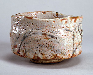
Beautiful imperfection? I dared not pester them with more pleas for meaning, but I wanted to better understand. Equipped with this concept, we re-entered the museum and came to a room filled with four hundred year old cooking ware and painted screens. We passed by a row of perfectly formed tea cups with exquisitely decorated rims so that we could admire a single slightly misshapen cracked bowl, whose colors were varied and muddied. Instead of a smooth finish, it was uneven and subtly blemished. I continued to stare at this vessel for a while, unmoving and silent.


My brain was still reeling from the glamour of Tokyo. The neon colors and frantic activity of the city had to be pushed away. I focused on the stillness of the room as I relaxed my breathing. Finally my impatient mind and chatty mouth quieted. I became aware of the bowl and all of it’s features. It was delicate yet rough. Crooked yet functional. Ugly yet compelling. Imperfect and beautiful. Without words I was then escorted to a display case containing a faded wooden folding screen onto which was painted a flurry of brushstrokes representing a cherry tree in an open field. A hazy mountain pierced low-laying clouds in the background. As I paused, the active disunity of the brushstrokes merged to form a complete motif. I became aware of each stroke, and each decision made by the artist. I noticed the emptiness between each brushstroke and the silent mood that the image evoked in me. The worn surface of the wood hinted at...what? Nostalgia, reverence, dignity.

I felt calm and giddy. My heart raced as I experienced a kind of sensation we artists feel when a great ignorance is removed from our perception and we encounter truth. The rest of the day, everything was transformed to my eyes. The remainder of my stay in Japan was a finely tuned awareness which has continued on into my life ever since. Visual aspects of the world have become almost magically enhanced. This has led to something else: I became aware of my own painting in ways I never had before: I became aware of what I now call poetry.

Wabi-Sabi is really two words, each with a deep and nearly untranslatable mmeaning.

Wabi stems from the Japanese root wa, meaning “peaceful,” “harmonious” and “at ease.” In it’s original meaning, wabi had a slightly belittling connotation of loneliness or sadness- withered or bleak. Yet it has now come to describe a healthy sense of humbleness and balance.

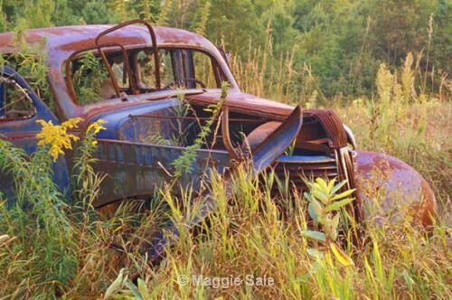
Sabi translates as “the effects of time”. The effects suggested are natural and part of a greater process. Think of how Rust overcomes an abandoned car in a field, turning it picturesque. Visualize the way surfaces fade and crack… how wrinkles overtake the skin of a woman as she gracefully ages or how intricate weeds entangle a neglected garden.


If Wabi means humble, and Sabi means weathered, then we have the exact opposite of the Western ideal of “perfection” nurtured by the Greeks and later by Europeans during the Renaissance.

America does not have a true phrase that is the equivalent of Wabi-Sabi. “Beautiful imperfection?” We have no such thing. We have adjectives like “antique,” “rustic,” and “weathered,” but these describe more of the imperfection of a thing rather than it’s beauty. We have phrases like “happy accident” or “controlled chaos,” but these fall short as well, sounding more like apologies rather than philosophies.

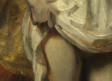
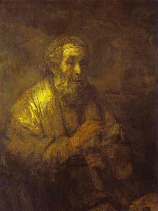
What I did rejoice in was the realization that this state, this feeling or whatever it was, was definable. Wabi-Sabi was something I had always loved and craved. It was the explanation for why the crumbled surfaces of paintings by Rembrandt radiate with such profound richness.


[Detail of Bathsheba by Rembrandt]


[Blind Philosopher by Rembrandt]

The European old masters allowed the paint variations to exist, unblended in their art. They applied paint with their fingers, or with their palette knives. They sought for a “feeling” rather than the visual replication of things.

Wabi-Sabi was the answer to the secret of Michelangelo’s unfinished marble figures called “the slaves” who appear to be still trapped in marble. They are half visible and half obscured, just like the moon had been described to me in my Japanese friend’s koan.


[The Slave by Michelangelo]


Wabi-Sabi was the hidden power behind the paintings and sculptures of the impressionists, whose glorious images of atmosphere and light seem to fall apart as the viewer steps closer to examine the surface of the canvas.


[Impressionist Sunrise by Claude Monet]

While much of the story of contemporary European and American painting has been a mad race to define “imperfection” as being pure ugliness, a similar effort has been made to define “beauty” as slick and neo-classical. What is missing is a striving for balance, a harmony of parts. Whether Western or Eastern, art is at it’s most dynamic and mature when it is drenched with “Wabi-Sabi”.

Of course,taking an ancient Japanese aesthetic and attempting to fit it into Western cultural experience may be looked upon as the height of ugliness. Then again, we are all linked to this sensation. While we all share an unspeakable longing for resolution, we withdrawl inward to remember and reflect. We all know the feeling of slipping our feet into worn, comfortable shoes.

Wabi-Sabi allows for personal expression, and individuality. There is a subtle quality that this implies- not the bombastic rush of adventure, but a quietness, or a transformation caught between phases. It is a lack of predictable precision. It is what we call A sense of mood.

Yet beyond art, we might go further in it’s broad implications. “Wabi-Sabi” could be a freeing way of approaching life. Embracing “Beautiful imperfection” would allow us to find poetry in the aspects of daily living which we now ignore or deplore.

Discover it in your world sometime unexpected, quietly.

Sunday, December 24, 2006

Pure Painting

There is no sense of good or bad. There is only activity, color and devotion.
It is an awe-inspiring thing to see forty six-year olds fill up forty blank papers with personal, meaningful creations...

I just finished conducting some holiday art workshops for children in Los Angeles. It is amazing to work alongside of little humans who create anything at a whim. They become so happy, and somtimes you can sense them nearly bursting with pride at what they have done.

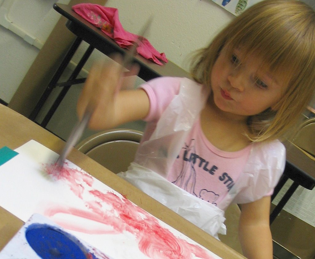
My own daughter Lorelei is two, and paints joyously. At times, she also gets very serious as she mixes the puddles of color...

Here is an image of her beginning a new painting on this Chrismas Eve.